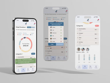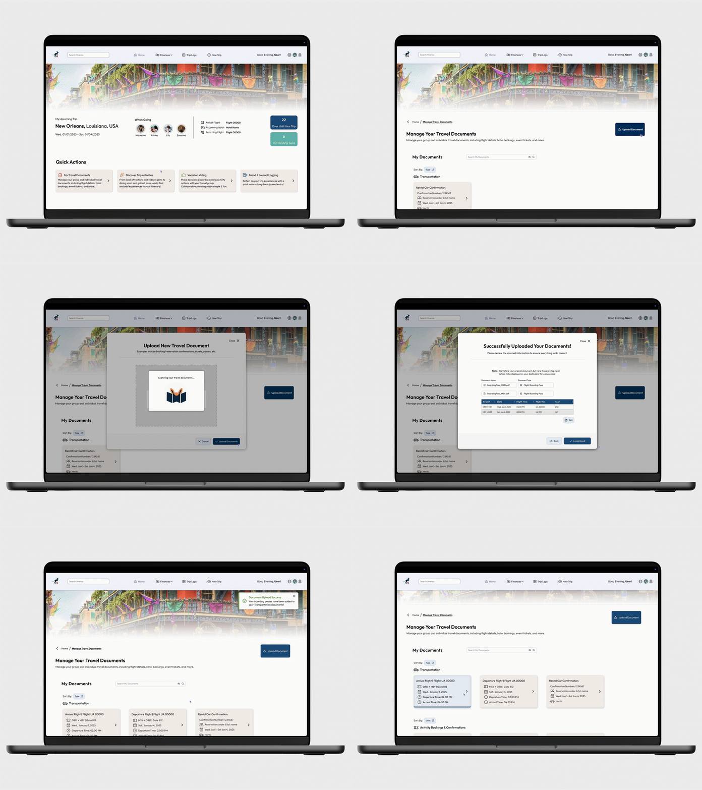
Collaborative Group Travel Planning Concept Mobile & Desktop Application
March–June 2025
Role: Designer, Researcher, Presenter
Software: Figma, Useberry, Google Slides
Introduction
Organizing group travel plans can be overwhelming, yet there are limited options to alleviate this stress. Supported by an academic literature review and in-depth competitive analyses of two current apps, existing travel-planning technology lacks key features users desire.
Alongside my two team members, we created Itineroo, a group travel experience application aimed at addressing common challenges in collaborative trip organization.
Project Goals
-
Enable multiple users to collaboratively plan trips in real time
-
Simplify shared budget creation and expense tracking
-
Support post-trip reflection through mood logging and journaling
Process
User interviews uncovered pain points regarding communication, decision-making, and budget visibility. These insights informed our low-fidelity prototype and key features:
-
Group Polling
-
Budget Tracking
-
Mood & Journal Logging
-
Location-Based Activity Discovery
-
Document Managing
Outcome
The high-fidelity prototype promotes intuitive decision-making, clearer task delegation, & financial transparency, supporting a more cohesive and low-stress group travel experience.
01
Research & Ideation
Based on our preliminary research findings, our team identified the MVP features to address group travel-related issues people typically encounter throughout their experience.
Methods used:
-
Relevant Competition Analysis
-
User Interviews
-
User Personas
-
Literature Reviews
Competitive Review & Sentiment Analysis
User Interview Protocol
User Interviews: Findings
User Personas
Preliminary Sketches
02
Low-Fidelity Prototypes
Our low-fidelity prototypes tested Itineroo’s core features: group voting, budgeting, activity suggestions, mood logging, and post-trip journals. Feedback from initial usability tests informed key design refinements, leading to a second, more streamlined version for further evaluation.
Before Trip Planning

Quick Actions
The app’s home page
Quick access to documents, finance, activities, and voting features
“To Do” widget with any pending items - polls, budget approvals, etc
Itinerary for each day of the trip

Group Voting
Vote in Active Polls & see other group members’ responses
Create a new poll
Specify poll options – expiration times, voter identification preferences, ability to add a new poll option as a participant
View completed or expired polls
During Trip

Discover Activities
Rate activities you have already completed
If you like the activity, find similar recommendations near you
Search for other types of activities like food/drink or entertainment
List view of suggestions with links that can bring you to more information

Budget Tracking
View data visualizations and list breakdowns of your trips’ budget
View budget for all your expenses or only split expenses
Make real time edits to categories
View expanded day-by-day budget breakdowns
Submit and/or approve group budget change requests

Mood Tracking
Log your mood and record short notes throughout your trip
View group members’ moods throughout the trip
Log a daily journal entry
View visualizations for all mood and journal data throughout the trip
03
Usability Testing
We conducted two rounds of usability testing:
-
Useberry was used for remote usability testing and behavior tracking. This platform permitted us to import Figma prototypes directly, enabling us to perform usability tests completely asynchronously.
-
Tableau was used to visualize data from Useberry for analysis and presentation.
Testing Timeline
Testing Materials Setup
8 pre-test questions (3 open-ended)
5 scenarios altogether, 11 total tasks
7 post-test questions (4 open-ended)
Uploaded all materials to Useberry
Version 1 Lo-Fi Usability Testing
Received 16 completed responses
Analyzed data & feedback to drive iterative changes for V2
Version 2 Lo-Fi Usability Testing
Revised tasks, questions, & prototype
Received 20 responses
Refine Design for Hi-Fi Iteration
Defined design system and style guide
Implemented changes based on V2 testing
Collected 3 user perceptions of hi-fi design
Lo-Fi Usability Testing
Version 1 Usability Test
Our first round of low-fidelity testing focused on core mobile and desktop scenarios.
Mobile:
-
Voting on a group activity
-
Creating a new poll
-
Editing a budget category
-
Discovering nearby activities
-
Logging a mood check-in and journal entry
-
Submitting a trip reflection
Desktop:
-
Viewing financial information
After completing all tasks, participants answered seven post-test questions to share their overall experience and provide actionable feedback for improvement.
Version 2 Usability Test
In our second round of low-fidelity testing, we re-evaluated core scenarios and introduced a new desktop task: uploading a travel document. We also adjusted our method by having users rate each task immediately after completion, reducing memory load and yielding more accurate feedback.
Usability Test V1 Findings:
After the first round of usability testing, we found that our lo-fi prototype was received well conceptually, but critical clarity and navigation issues caused confusion.
4.38 avg difficulty rating out of 7 (0= difficult, 7= very easy)
88.89% completion rate
46% felt overwhelmed by the amount of content on the screen
Users experienced navigation issues, unclear task flows, and terminology confusion
Examples: Mobile & Desktop Budget Editing Tasks
Scattered and incorrect click areas indicate clear confusion among users where to edit their budget.
We observed visible improvement between Version 1 and Version 2 usability tests, indicating successful design changes based on V1 feedback.
Usability Test V2 Findings
After the first round of usability testing, we found that our lo-fi prototype was received well conceptually, but critical clarity and navigation issues caused confusion.
We clarified our test questions, corrected our Figma prototype flows, simplified our screens
5.50 avg difficulty rating out of 7 (0= difficult, 7= very easy)
100% completion rate
5.97 avg clicks per question
(improvement from 7.84 avg clicks per question in V1)
Users found budget editing and
mood logging to be too complex
Improved Task Success Example: Mobile & Desktop Budget Editing Tasks
Mobile Design Changes:
-
Moved "Edit" button near "Categories" list for better visibility
-
Reduced random clicking, users either selected the legend label, category list, or edit button
Desktop Design Changes:
-
Did not make changes between V1 and V2, but still increased task performance
-
Only two missed clicks on graphs
Action Items for High-Fi Prototype
Before the final prototype, we analyzed the usability test results and turned the feedback into action items. This helped resolve outstanding inconsistencies, unintuitive areas, and any common user mistakes.
Make desktop footer clickable, various users attempted to navigate using it.
Fix some incorrect click paths between screens to reduce user error and confusion
Solidify design system & brand kit
Streamline finding nearby activities further
Replace placeholder content with more realistic data
Make “upload document” button more obvious on desktop
Make desktop home header content navigable to travel document upload page
Take an in-depth look at our usability study results, data analysis, and the design changes implemented as we worked to improve Itineroo's effectiveness & intuitiveness.
Version 1 Usability Testing
Version 2 Usability Testing
Mobile Screens
Before a Trip
Onboarding
Creating a profile
Specifying system preferences & customization
Creating or join a trip
Adding travelers from contact list
Homescreen
Quick actions easily distinguishable
Multiple ways to navigate to another screen
Horizontal scrolling multi-day itinerary cards
Group Voting
Ability to collapse/expand polls to minimize visual clutter
Visually distinct chip action bar to switch between polls
Creating a new poll
Ability to opt out of voting
Visual indicator for who voted and who has not
View poll result after casting a vote
Manage Budget & Finances
View individual and group budget data visualizations
Expand day-by-day spending breakdowns per category
Make edits to spending categories & expand daily
Submit and/or approve group budget change requests
During a Trip
Discover Things to Do
Renamed from "Discover Activities" to be more all-encompassing
View activity suggestions
Search map by category
List view option
Add activity from map/list directly to itinerary
Mood Tracking & Journal Logs
Log your mood and record short notes throughout your trip
View group members’ moods throughout the trip and comment on them
View overall mood trends and journal data
Option to make mood or journal logs private or visible to the group
After a Trip
Post-Trip Reflection
Log a post-trip reflection on the last day of the trip
View group members’ reflections and comment on them
Vote on group member superlatives
Option to make trip reflection private or visible to the group
Desktop Walkthroughs
Iterative Changes
Allow users to navigate the desktop version with the footer.
Make the “upload document” button more obvious.
Increase size of home header content navigable to travel document upload page.
Fix incorrect click paths between screens to reduce user error and confusion.
05
Design System
We built a custom design system for Itineroo, defining colors, typography, reusable components, buttons, and icons. Our goal was to create a friendly, inviting interface that reflects the excitement and fun of trip planning.
We selected Outfit, a rounded sans-serif typeface, for its approachable tone, and used a muted, soft color palette to maintain a calm and cohesive visual identity.

Color Palette
Primary Colors
Blue
1A5483
Orange
EEB17B
Light Blue
84ABD6
Coral
FF8A80
Green
89B36F
Secondary Colors
Red
AD5454
Teal
68BAB3
Pink
EB9E94
Pale Blue
E7F0FF
Light Green
A8BBA2
Beige
F5F0ED
Brand Imagery
Logo Variations


Additional Imagery


Typography Styles (not to scale)
Mobile
Desktop


